featured

attractive woman doing yoga

Sport and spine brand identity design

This sport and spine brand identity was designed for Satura Mountain, Sport and Spine, an innovative health & wellness clinic specialising in chiropractic, physiotherapy and massage treatments. I was hired by, and collaborated with DIFRNT to design the brand identity, website and other digital collateral. Credits: Graphic, logo and website design – Jonathan Whelan Creative …

Sport and spine brand identity design Read More »

Go on, share it…
A lady talking on the phone and ignoring a man trying to get her attention

Using natural language processing technology

Converlens is an Australian based technology company. The innovative software they have created is using natural language processing technology to analyse, and transform data into meaningful insights. The software is so simple and intuitive that nearly anyone can use it without needing to be an analyst. I was hired by, and collaborated with, Sherpa Brand …

Using natural language processing technology Read More »

Go on, share it…
A dark skinned female scientist analysing data in a crop field in Africa

Climate change adaptation strategies in Africa

Climate change adaptation strategies in Africa are being implemented by Future Climate for Africa (FCFA), a research and development programme using scientific knowledge to predict the impact of climate change in Africa. I was hired by Soapbox Films to create the video below, which explains how climate change is affecting Africa economically and environmentally, and …

Climate change adaptation strategies in Africa Read More »

Go on, share it…
Comsol 5G Featured Image

Comsol 5G explainer video

Project requirements:Create simple, modern, illustrations and translate them into motion graphics for social media posts, and a 35 second pre-roll video explaining Comsol 5G’s features and benefits. Illustration Details and style guides: Go on, share it…

Go on, share it…
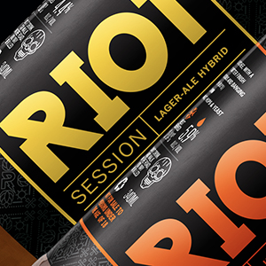
Riot Beer Thumbnail

Riot Beer label redesign

Riot Beer tasked us with redesigning their range of beer labels. They are a local Cape Town (South Africa) craft beer brewery. The brief was simply to be bold and loud with a twist. The previous labels were getting lost between all the competitor’s labels, and the client needed their brand to stand out, be loud and proud while still maintaining its rock ‘n roll edge and having an air of sophistication. My solution was to add hidden details in the patterns and subtle illustrations to reinforce the history behind the brand, but at the same time keeping the design clean, contemporary and simple.

Go on, share it…