
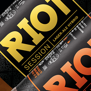
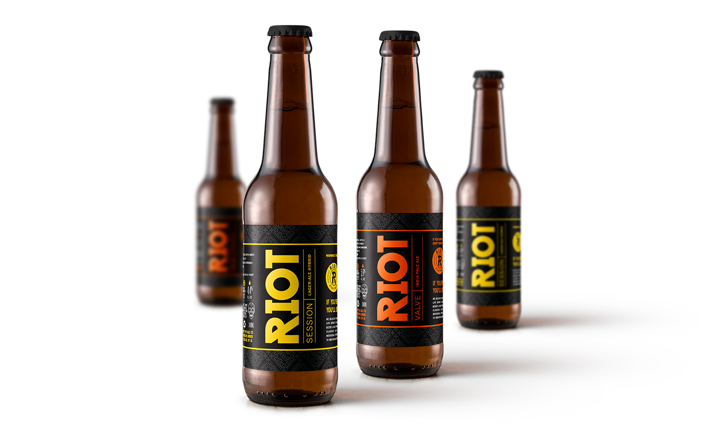
Riot Beer tasked us with redesigning their range of beer labels. They are a local Cape Town (South Africa) craft beer brewery. The brief was simply to be bold and loud with a twist. The previous labels were getting lost between all the competitor’s labels, and the client needed their brand to stand out, be loud and proud while still maintaining its rock ‘n roll edge and having an air of sophistication. My solution was to add hidden details in the patterns and subtle illustrations to reinforce the history behind the brand, but at the same time keeping the design clean, contemporary and simple.

Before and after


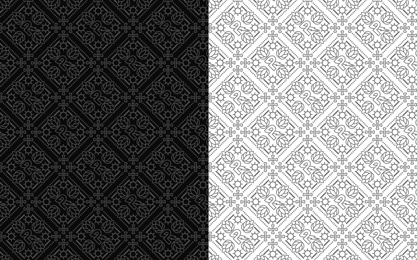
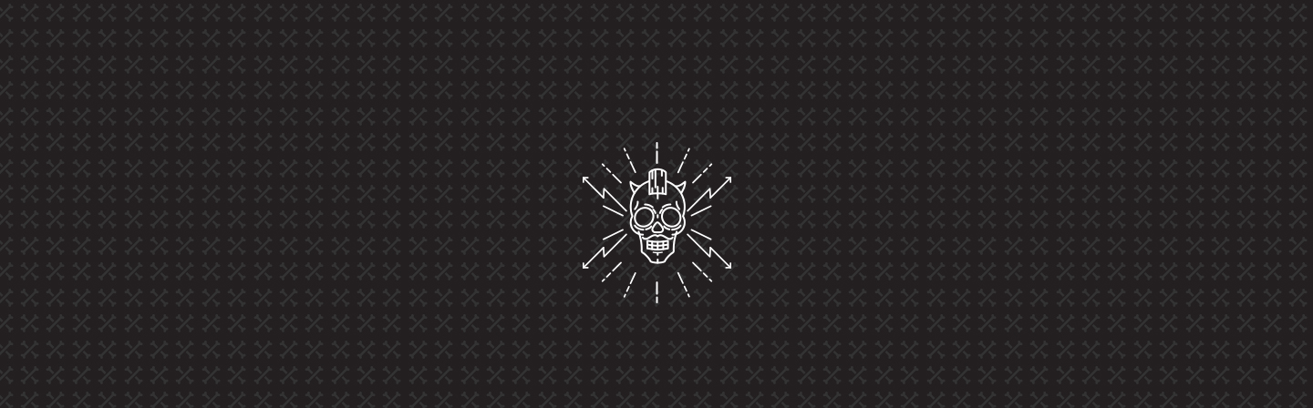
Pattern designs

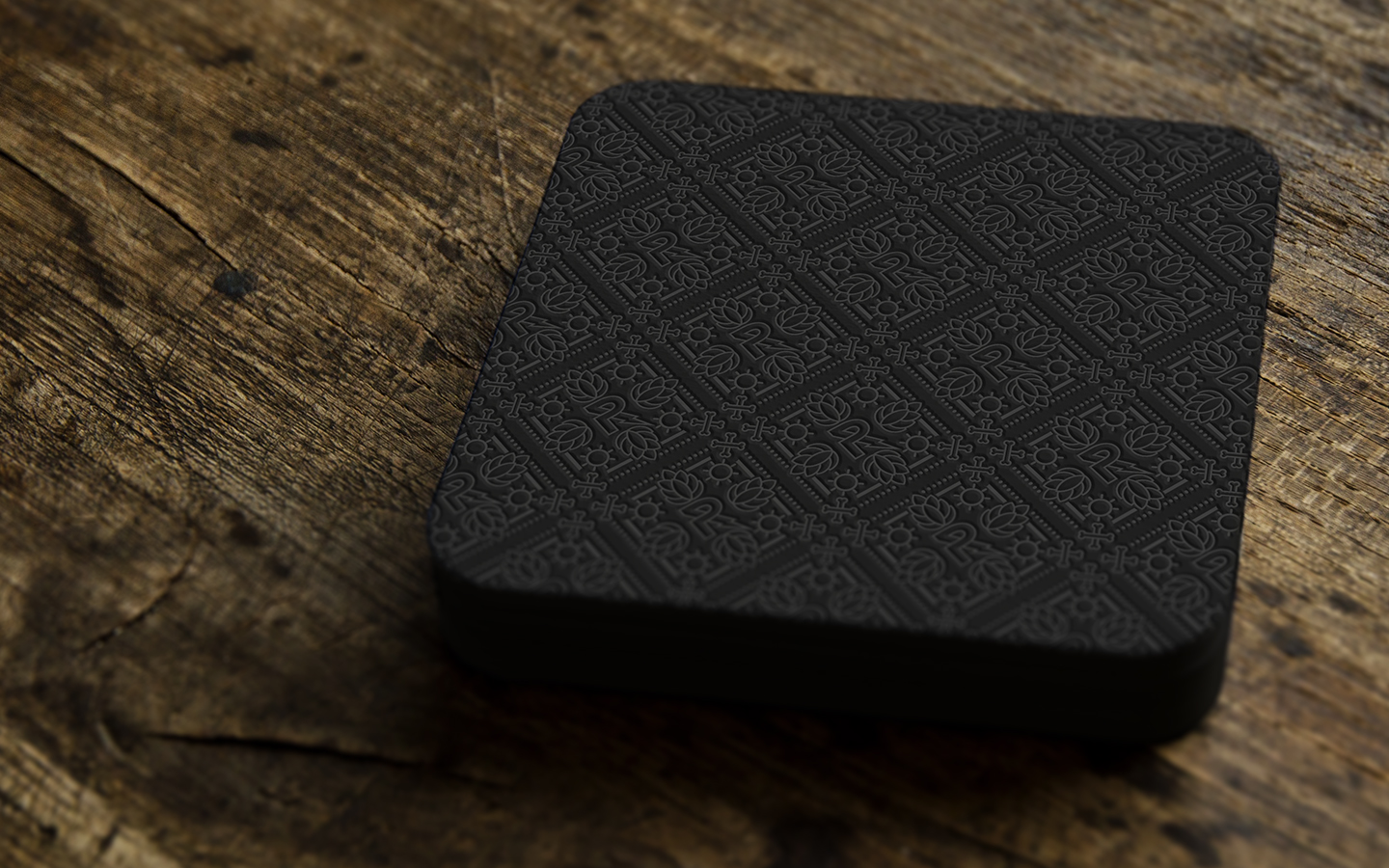
Embossed beer mats

Go on, share it…