The Brief:
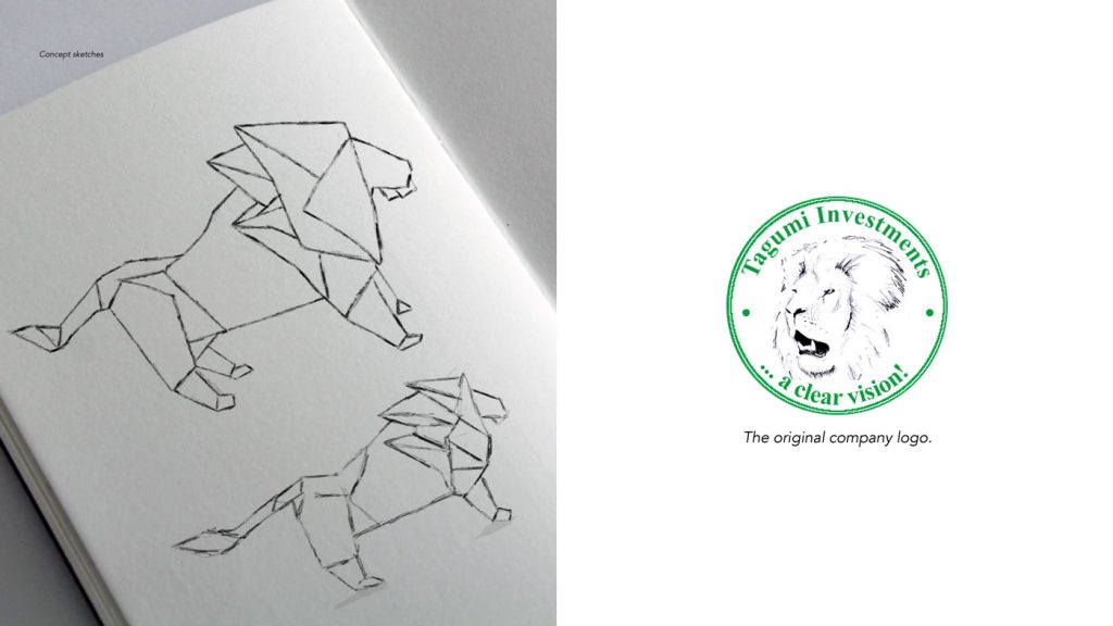
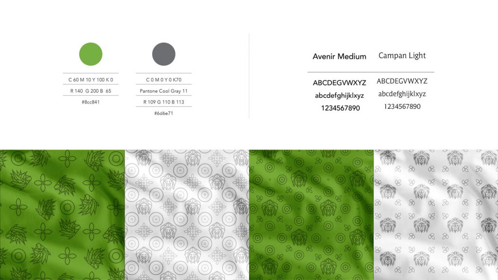
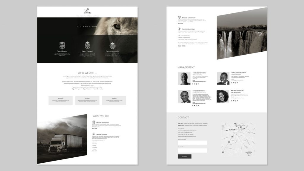
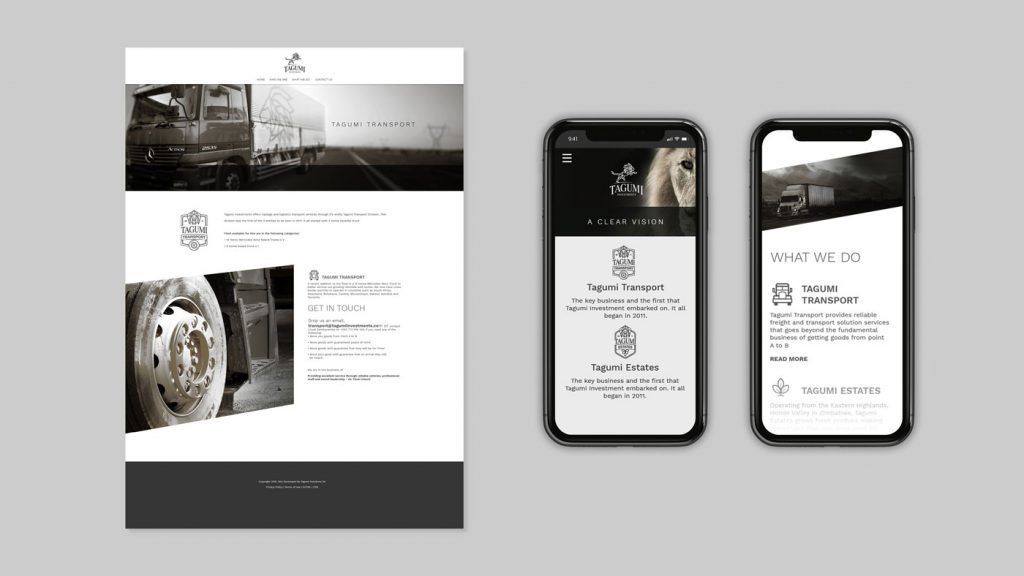
Tagumi Investments, an investment holding company based in Zimbabwe Africa, tasked Jonathan Whelan Creative Consulting, to come up with a fresh look and feel for their brand. The client’s one important wish was to include a lion motif, a legacy icon carried over from the company’s inception. As a family owned business, the partners wanted the updated icon to represent strength and their positioning of “A clear vision” in a unique way. This look had to be translated onto all applications, including interiors, apparel, vehicles, print and digital.
The Solution:
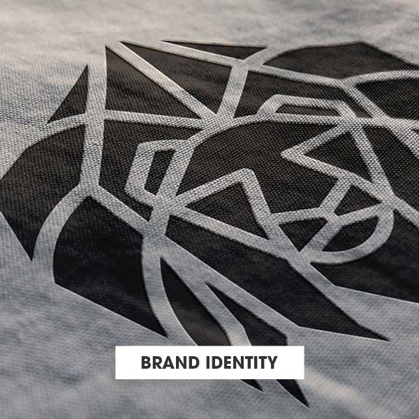
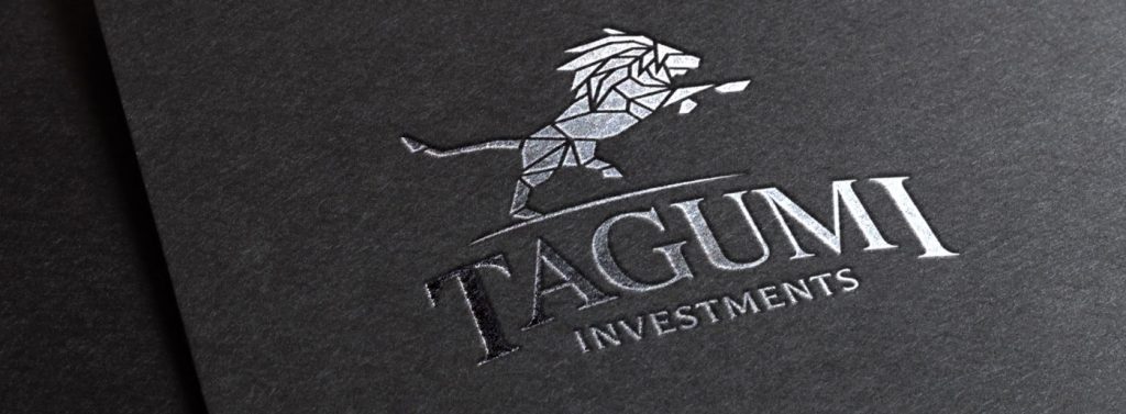
To demonstrate strength, integrity and the intricate details of the holding companies clear vision and multiple divisions, I chose to use the concept of Origami. By taking a simple flimsy piece of paper and folding it in the form of a lion, we see how the paper transforms into a strong bond with a beautiful end result.
